11.14.2011

A Pretty Place to Sit: Place Settings

Number one: My blog needs a major over haul on it's look. I know, I know it's bad. Every time I come here (which is not as often as I wish, which might have something to do with how ugly it is...) I am disappointed in the way it looks (to say the least). It needs a face lift. Who am I kidding, it needs a nose job, a little botox and some air brushing. It needs an entire re-do!

Number two (the real reason for the post): THANKSGIVING!!! Fall, Autumn, whatever you want to call it, it always puts me in a good mood. (despite the ugly blog!) I get to change the arrangements hanging on my front door, my fireplace mantel gets a little color, and my house reaks of cinnamon, sugar, and pumpkin bread. Oh, and I start thinking of Thanksgiving.

We all know food usually takes the spotlight on this wonderful holiday, but we can't forget the supporting characters. Decorations, beautiful serving dishes, and place settings. I rounded up a bunch of items around my house and filled in the blanks with a few purchased items. I came up with a few ideas/ color schemes to help make a beatiful spread.

*Disclaimer: I may or may not have set my settings correctly. I didn't take the time to think about it before I started snapping pictures. It's not like my house is fine dining or anything. Right?*


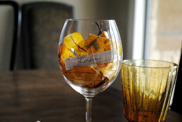
I call this one "Fields of Gold"


I found the dried berry bunch at a farmers market last fall. The place card is a Martha Stewart template.


Up Next: "Autumn Leaves"


I found the square plate at Big Lots for $2, and the glass leaf shaped dish at Michaels for $1.


"Gobble Gobble"


One of the simplest settings but definetle showcases the main dude of the day! I got him at World Market for $4. I just love 'em.


"Harvest"


And finally: "Leftovers"


This one is a little bit of everything. What makes it work is the color combo I think.


Hope you all have a wonderful Holiday and a beautiful table spread!

8.27.2011

I Scream. You Scream. We all Scream for Ice Cream!!!


Funny story really. My husband has been talking about getting an ice cream maker since the beginning of summer. {and in Texas, summer started way back in March} Finally one day he dings me on google chat {we talk a lot throughout the day on that thing. It's pretty handy} to tell me about an ice cream maker he found on Amazon that was on sale.

$2600 ~he dings.
Uhmmmmm, what? Sale? I am thinking yeah right, he must be joking.
~Haha sure, I ding back. Great deal you should get it.

A few days later he tells me the ice cream maker should be delivered by the end of the week.
 My. Mouth. Dropped.
"WHAT? You bought it"?
"Well, yeah", he says, "You said it was a good deal".
"Not for TWO THOUSAND SIX HUNDRED dollars it isn't".

Come to find out it was only Two HUNDRED and sixty dollars. He added a zero too many.
I still am not convinced I would have agreed even at that price, but it's a little late now.

So, thanks to intsant MIScommunication and one zero too many, we now have this really cool ice cream maker. As per any new appliance/gizmo/thing that makes yummy stuff, we were super excited to start using it. We made, vanilla {twice}, chocolate and coffee ice cream all in one week. It was a little out of hand and we were in desperate need to get rid of some or most of it. {All this ice cream isn't exactly helping me lose the 5 lbs I want gone by the beginning of Sept when we take family photos *sigh*}

I suggested a neighborly ice cream social!

AND what is a party with out the right decorations. Right? Very much inspired, {feels SO good to be inspired again} I came up with some fun ideas. I made an ice cream banner and colorful cups to serve the heavenly iced cream in.

I know. I know. That was a really long story for just a bunch of decorations right? Well, hopefully it was worth the read and maybe you'll be inspired too!

I have learned {oh-so-quickly}, time isn't something that comes in large doses when you are a new mom.
So I gotta use my time while I have it!
A sleeping baby allows for the perfect opportunity :)

p.s. I LOVE love love my video monitor!


Materials:
Colorful Tissue Paper
Colored Card Stock/ Construction Paper
String or Ribbon
Tape- Double Sided and Regular
Small Plastic Cups
Scissors
Cutting Board
Straight Edge

8.11.2011

Lite it up

So last week I was sprucing my home up just before a group of wonderful ladies gathered at my house for our monthly bunco game. {And when I say just before, I mean two days before. Yes, it took me two whole days to get this place into shape, and no my house does not look like it belongs in a magazine all the time or even most of the time. Although my husband would probably love me just a little bit more if it was.} I would be the first to admit that my fireplace could use a little love. It's sad really. I mean, it makes me sad looking at it. So grand and so very much part of the room and yet I have continued to neglect it. Orginally I had two hurricane glasses with stands sitting on the hearth of the fireplace. Totally an after thought and it showed. To make matters worse, the stand that holds the wood while the fire is burning was just sitting there... bare. Nothing to show for itself. I had had just about enough of this when suddenly it came to me.

Why not put the hurricane IN the fireplace with candles?

Then while upstairs digging through my craft closet {another space in despereate need for attention} I spied tons more glass candle holders. Well duh! I should use all of them!

Now I know this isn't exactly a new idea, but it's one that I haven't used before and thought I'd share. Maybe you have done it before, maybe not, but I think it's a fantastic way to use your fireplace in the summer.


 I used all glass candle holders I have collected from various places. Ikea, Kohls, Dollar Store, my Grandma's house, and other random places.


 All lit up it creates a very cozy feeling in the room.


8.08.2011

Elements and Principle: LINE

When we talk about interior design it is very easy to get caught up in fabric, and accessories, and the furniture, and the art work, and the light fixtures, and basically all the fun (and fundamentally important) stuff that most people would notice in a room. But believe it or not, there are some things going on underneath all of that "stuff" that really makes good design, well, good design.

These things are called the Elements and Principles of Design.

I know! That sounds REALLY boring. Potentially it could be, but hopefully I can make it exciting, or at least less boring. (don't wanna work it up just to fall flat on my face.)
I can't make any promises here, but I thought I would be doing all of my readers a huge injustice not to talk about these things. It's pretty interesting if you apply it to the right idea. Now, I do have a degree claiming that I am knowledgeable in Interior Design, but I am by know means an expert at this elements and principles stuff. In fact, after doing a little digging I am finding that it's really a matter of interpretation. So don't hesitate to join in the conversation!

There are several elements and several principles to talk about. I have decided to break each one down into their own post. Since I now have a little human being competing for my attention (and he always wins!), I might be a little slow to get them all posted.

I think this should be fun! So here we go!
Lets start with the simplest element of them all... LINE.

Here is a very general (and very boring) definition:
“When a point moves through space or when two points are connected, LINE is generated.[…] We see lines where things have edges, where one plane meets another, or where there is a change of color or surface in a plane.” Source: Interior Design third edition John F. Pile.


10.21.2010

the color of Mexico

My husband and I took a little trip down to Mexico. Part babymoon, part family vacation.
Every time I go, I am blown away by the use of color in everyday life. This is one culture that is not afraid of color. It is a nice get away from America's comfort zone... beige.


9.17.2010

Baby Time!

I would like to make an apology. I am not sure if there are even very many of you out there that reads my design blog, but for those of you who did I am sure you gave up hope. I am here to restore it.

I was on the verge of being on top of things, and then I got pregnant. It was planned, but the way this pregnancy has been going has been completely unpredictable. Since the middle of May, I have been pretty busy making a baby and the baby has been pretty busy making me sick. But, lately there have been signs of change. Good change! No more sickness.

I hope I can get back to life as I knew it... kind of. In celebration of my return and in celebration of making a baby, I thought it would be appropriate to talk about the nursery. I know as of lately it has become popular to wait to find out what the baby is. We considered this, but with this being our first child, we figured there were tons of surprises in store for us. By knowing the gender I feel like I have some sort of sanity. =)

So, our baby is going to be a BOY!

Immediately I high tailed it to all the online places in search of bedding, color ideas and other fun nursery stuff. Now, when it comes to design, I haven't dealt a lot with the nursery. So, I have pretty much an open mind and an clean palette to start.

Let me show you where I got my inspiration.

Some friends of mine in Kansas gave me a little surprise baby shower before we moved away. This was the diaper cake they made for me. I instantly fell in love with the idea of using Black and White Polka Dots. I figured it could go either way. If we were to have a girl, I'd tie in Sunflowers and Bumble Bees. Since we are having a boy, I am heading in the direction of trucks, boats, and planes. I know that sounds like a lot, but go with me on this. I found when looking online the trend seems to be BROWN. Pink and brown for a girl, blue and brown for a boy, and yellow, orange and brown for gender neutral. I know that brown has been popping up every where and though I love it, it's not for my baby. I think I want to go in a brighter direction. I love the idea of black and white because if offers the opportunity to add any pop of color. Sticking with my inspiration I decided to use accents of red, yellow, and grey!


A good way to make sure I stay on track with my theme is to create a mood board. I pulled together some fabric samples and paint colors to make sure that what I was seeing in my mind, actually worked in reality.
This is my mood board so far...


I will use the black and white theme as the main focus in the room. So the big ticket items will be black and white, like the bedding, the furniture, and the window treatments. The smaller details in the room will keep true to the red, yellow, and grey accents. For instance, art work, pillows, and/or lamp shades. 

I am excited to get this party started! I hope to post more as the nursery comes together!


3.28.2010

Speaking of Wallpaper


Another Sticker on the Wall is an online archive of wall decals from around the world. Next to each image of the decal is the store link that provides that product. The decals range from single piece stickers to entire wall coverings (I suppose otherwise known as Wallpaper).
                                        
svarmor Svärmor Wallpaper adesivo de parede wallpaper papel de parede sitcker decal wall vynil

peacock Exotic Black/White modern peacock bird damask wallpaper adesivo de parede wallpaper papel de parede sitcker decal wall vynilfruitsdesign_celery Fruits of Design - Celery Wallpaper adesivo de parede wallpaper papel de parede sitcker decal wall vynil

A way to fill blank space or spruce up an old space, inspiration is abundant at Another Sticker on the Wall (dot com).

2.26.2010

Half Off! Who doesn't love that?

Company C is having an awesome sale. Half off selective quilts, shams and other essential pieces! Even if you are not in the market for any bedding, it is still worth the time to take a look!

This is one of the best deals. The Nirvana Quilt is reversible and comes in a great combination of colors. I am thinking an accent peice at the end of a bed for a splash of color or give as a gift to brighten someones day. (Cheese I know, but it's true. Who doesn't love a cozy quilt?)


We sell this stuff at our shop. Quality is really second to none and I love all the little details in every piece, like the stiching and the sweet little embellishments. I haven't seen a sale like this before from this company. AND they are even offering $20.00 off  for a purchase of $100.00 or more.


Fabric: Maija Louekari


It was love at first sight when I spotted this mod fabric in last November's Metropolitan Home. Instantly I envisioned many ways this fun print could brighten any space. An upholstered chair, table cloth, or even a wall hanging. Hand drawn by a young inspirational Finnish artist, Maija Louekari, this fabric is only one of many cool prints.

Louekari has a collection of cups, serving platters and plates that showcase her organic simple drawings. She has teamed up with marimekko to bring this collection to life.

2.12.2010

Wall Paper: a second chance

Someone asked me the other day what I thought about wallpaper. My first reaction is.... I love it! For those of you going... HUH? This may be what you have in mind when you think of wall paper.


But it doesn't have to be that way. In fact, wallpaper has come a long way in design, material and application. I really think wallpaper got it's bad name because it was not exactly easy to get off the wall, and a lot of wallpaper stuck around much longer than it should have. (That lovely ivy border around your mom's kitchen. yikes!) Remember wallpaper should be temporary. Wallpaper is meant to be a permanent fixture in your home, but rather a fun way to add life and visual interest to a room for a season. I believe that wallpaper manufactures are now producing higher quality paper which leads to a better application and an easier removal. Notice I said easiER, not easy. I am not making any promises here. (That's my disclaimer. haha.)

Anyway, I found a bunch of rooms that I thought really showcase wallpaper. Remember, when choosing a wallpaper keep quality in mind. It will make a difference in the end.

I especially like this one. It is so subtle and it  really brings a calming element to the room.


In this example take a look at the texture the paper adds to the room.